%20Logo.png?width=100&height=100&name=brs%20(Bow%20River%20Solutions)%20Logo.png)
 By
·
4 minute read
By
·
4 minute read
Power BI Paginated Reports are known for precision, consistency, and scale. They are trusted for operational reporting, financial statements, regulatory outputs, and executive-ready documents. But a well-structured report is only the starting point.
What separates a good paginated report from a great one is interactivity—how users explore information, how quickly leaders get answers, and how efficiently organizations reduce follow-up questions and rework.
In this stage of report design, the focus shifts from building the report to using the report. The goal is to deliver insight clearly for decision-makers while giving end users just enough control to explore data without breaking governance or design standards.
Why Interactivity Matters in Paginated Reports
For executives, interactivity means:
- Faster access to the numbers that matter
- Less dependency on analysts for follow-up questions
- Confidence that insights are consistent and governed
For end users, interactivity means:
- The ability to explore details without exporting data
- Clear navigation through large or complex reports
- Contextual explanations that reduce confusion
Paginated Reports support this balance through a focused set of interactive features—designed to enhance clarity without turning reports into free-form dashboards.

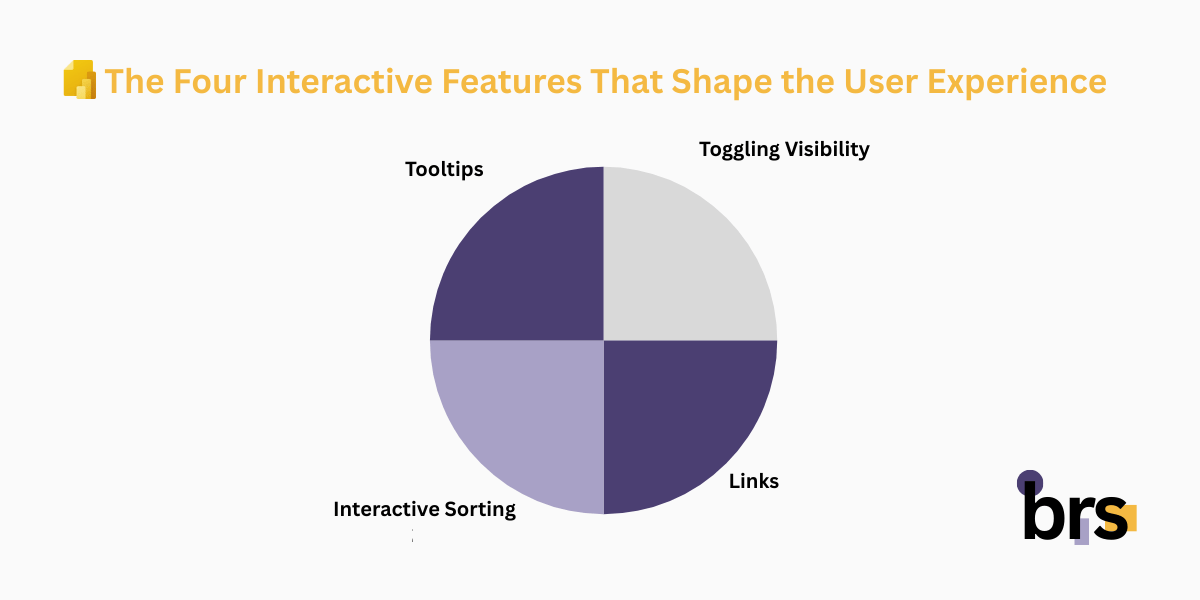
The Four Interactive Features That Shape the User Experience
Power BI Paginated Reports support four core interaction patterns:
- Toggling visibility for drill-down and drill-up behavior
- Links to navigate within the report or to other resources
- Interactive sorting within tables
- Tooltips that provide context without clutter
Each feature serves a specific purpose and must be applied intentionally, based on how the report will be consumed.
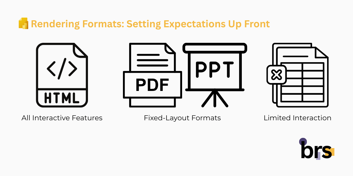
Rendering Formats: Setting Expectations Up Front
Not all output formats support interactivity in the same way. This is a critical design consideration for both business leaders and report authors.
- HTML rendering supports all interactive features
- PDF and PowerPoint are fixed-layout formats
- Excel supports limited interaction, including visibility toggling
Because reports are often viewed on screen, exported, or delivered through subscriptions, Paginated Reports provide a render format object that can be referenced in expressions. This allows reports to adapt intelligently to how they are delivered.
From a leadership perspective, this ensures consistency and predictability. From a user perspective, it prevents features from appearing when they are not usable.
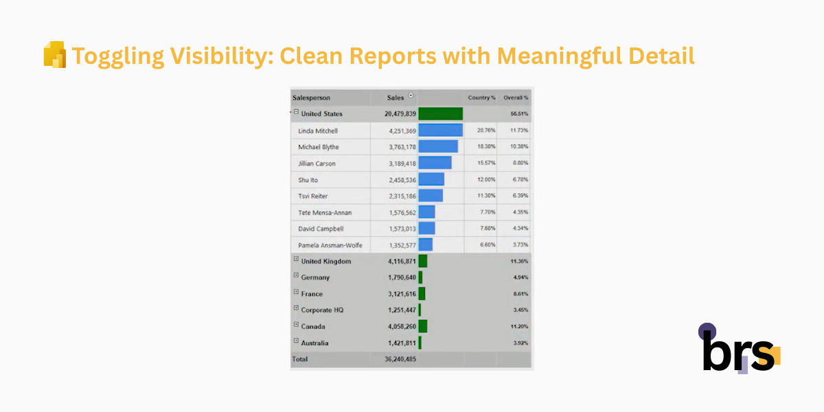
Toggling Visibility: Clean Reports with Meaningful Detail
Visibility toggling is the foundation of structured drill-down in Paginated Reports. It allows designers to hide detail by default and reveal it only when needed.
This approach benefits:
- Executives who want high-level summaries first
- Managers who need selective detail
- Operational users who occasionally need transaction-level data
How Visibility Toggling Is Used
- Applied to tablix rows, columns, groups, or textboxes
- One item acts as a toggle control
- Another item responds by showing or hiding content
This creates a guided experience: users see just enough information and can expand only when required.
Format Considerations
Visibility toggling works in:
- HTML
- Excel
If a report is primarily consumed as a PDF, visibility toggling should be limited or conditionally disabled to avoid confusion.
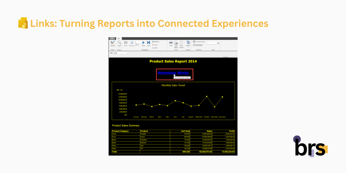
Links: Turning Reports into Connected Experiences
Links allow paginated reports to function as part of a broader reporting ecosystem rather than standalone documents.
Common Link Types
- Bookmark links
Jump to another section within the same report. Useful for long reports, summaries, or navigation panels. - Hyperlinks
Navigate to external resources, websites, or other reports—including other paginated reports or interactive Power BI reports.
Links can also pass parameters, preserving context as users move between reports. For leaders, this means continuity. For users, it means fewer steps to get answers.
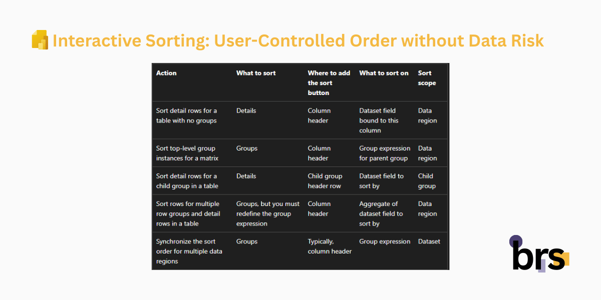
Interactive Sorting: User-Controlled Order without Data Risk
Interactive sorting gives users control over how data is ordered—without changing the underlying dataset or business logic.
This feature applies only to HTML-rendered reports and works within tablix headers or group headers.
What Users Can Do
- Click column headers to sort ascending or descending
- Sort using expressions defined by the report author
- Apply multi-column sorting
Multi-column sorting allows users to sort by more than one field—such as sorting first by department and then by revenue—by selecting columns in sequence.
From a governance perspective, sorting affects presentation only. From a user perspective, it enables quick comparisons without additional reports.
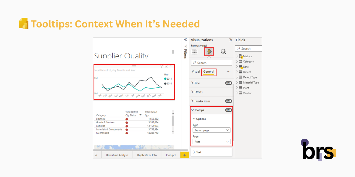
Tooltips: Context When It’s Needed
Tooltips provide extra information without adding visual noise. They appear when users hover over a report item and can include explanations, definitions, or supplemental values.
Tooltips are especially useful for:
- Clarifying calculated fields
- Explaining business rules
- Adding definitions for metrics or abbreviations
Because tooltips rely on hover behavior, they work only in HTML-rendered reports. Any information critical to interpretation should still be visible directly on the report surface.
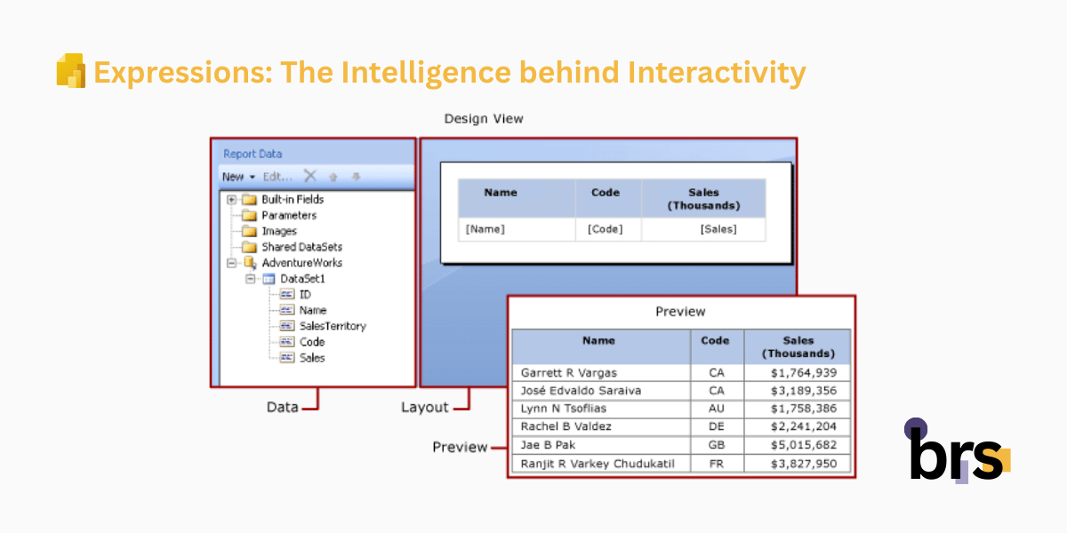
Expressions: The Intelligence behind Interactivity
Expressions are what make interactive features flexible and reliable. They allow report authors to:
- Control visibility dynamically
- Detect the current rendering format
- Adjust layouts and behavior by context
- Customize subscription previews
For example, subscription emails often include an image preview along with a PDF attachment. Using expressions, the preview image can show a simplified or alternative view—while the attachment contains full detail.
This ensures every delivery method is optimized for how it will be consumed.
Designing Reports That Scale Across Audiences
To ensure paginated reports serve both leadership and operational users effectively:
- Design for the primary viewing format first
- Use interactivity to simplify, not impress
- Avoid hiding critical information behind hover-only features
- Make navigation intentional and obvious
- Test reports in HTML, PDF, Excel, and subscription views
For executives, this results in clarity and confidence. For end users, it creates usability without complexity.
Conclusion
Interactivity in Power BI Paginated Reports is about clarity, not complexity. When used intentionally, features like visibility toggling, links, sorting, and tooltips help executives get answers faster and allow users to explore data without breaking structure or governance.
The result is a single report that works across audiences and formats—clear for leadership, practical for end users, and reliable at scale.
At brs, we can help you turn your data into insights with Power BI. Whether you are in oil and gas, mining, or manufacturing, our team can design and implement interactive reports or paginated reports tailored to your needs.
Your data is your most valuable asset — let us help you visualize it. Contact us today at info@bowriversolutions.com or visit www.bowriversolutions.com to start your data visualization journey.
About This Series
This article is part of our Power BI Paginated Reports Series, a structured guide designed for both business leaders and report authors.
For C-level and senior decision-makers, the series explains how paginated reports support operational reporting, governance, scalability, and consistent decision-making across the organization. For analysts, developers, and power users, it provides practical insight into how paginated reports are designed, built, and refined using Power BI Report Builder.
Each article focuses on a specific stage of the paginated report lifecycle—from foundational concepts to advanced capabilities. You can explore the series in order or jump directly to related topics:
-
Previous article: Power BI Paginated Reports Series: Visualizing Report Data
-
Next article: Power BI Paginated Reports Series: Beyond Report Development
-
View the full series: https://bowriversolutions.com/blog